|
« |
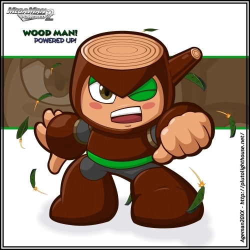
WoodMan : Powered Up!Adrian Marceau - 2006/08/20 |
|

| Title : | WoodMan : Powered Up! |
| Artist : | Adrian Marceau |
| Published : | August 20th, 2006 |
| Updated : | April 11th, 2009 |
| Mediums : | Adobe Flash |
| Tags : | mega-manwood-manrobot-master |
| Related : | Full ResolutionWoodman PencilWoodman Draft 1 |
I really like the artwork style for the MegaMan Powered Up game so I decided to try my hand at it.
The first piece of artwork I decided to try was a Robot Master that had not yet been made into a Powered Up form - WoodMan. WoodMan was, and still is my favorite Robot Master from Mega Man 2 for the NES so he came first for me.
The actual style was pretty tricky to mimic at first. I started with a small little pencil doodle in super-chibi form and scanned it in. Then in Flash, (my favorite program for crisp lines and shading) I traced around (not over) the lines.
By tracing around the lines, I was able to pull the tracing farther apart and make the lines thicker. This was good, because Powered Up style has huge line thickness. I then chose a colour for the lines (I first started with dark brown but green seemed to fit better later) and then the colouring was no problem.
I think this is by-far one of my favorite pieces of artwork - it just turned out so damn well. Lol.
I think he's totally adorable and I only wish I had a plushy of him or something...lol.
What do you think?
2006/08/21 : I can't decide which colour lines to use! Lol. I've been switching back and forth between brown and green outlines but I can't decide which one I like better. I settle on green and then I change my mind and want brown and then it starts over again. They're green right now - I wonder if it'll last.
2009/02/01 : I've decided to start refining some of my older Powered Ups - giving them backgrounds, adjusting shading/colour, redoing certain lineart, etc. WoodMan was one of them but recieved the least-amount of changed. I modified the colour of his lineart to be brown (yep, I changed it again, lol) and I added a gradient background. Yay?
2009/04/11 : As with the rest of in the series this image has scraped the gradient background of old and has been upgraded to the new retro-background style of the others. A few razor leafs have been scattered for effect and I re-shaded his one eye a bit differently. I think he looks pretty good but there wasn't that much I could have changed - he turned out pretty good the first time. :)