|
« |
BubbleMan : Powered UpAdrian Marceau - 2008/07/11 |
|
| Title : | BubbleMan : Powered Up |
| Artist : | Adrian Marceau |
| Published : | July 11th, 2008 |
| Updated : | December 4th, 2009 |
| Mediums : | Adobe Flash |
| Tags : | mega-manbubble-manrobot-master |
| Related : | Full ResolutionBubbleMan PencilBubbleMan Draft 1BubbleMan Draft 2BubbleMan Draft 3 |
Wow, this took a while. Might not seem like it, being posted so soon after NumberMan Powered Up, but this really did take a long time. I worked on NumberMan casually throughout a single day - this one I worked on non-stop for hours spread out over three days.
That being said - I really like how it (finally) turned out. And I don't just say that because it took a long time to CG - I've had this drawn for quite a while now - maybe over a year? It's just now that I finally felt I could CG it and despite a few...falters...I think I did okay for myself. :D
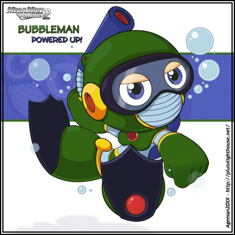
Overall, I think he's super cute and I'm glad I finally got him out of the way because I knew he'd be a challenge. Not quite sure why, but I wasn't looking forward to him. He's got a strange angle and I wish I would have picked a better pose while drawing, but that's how it goes.
As far as CGing goes, there are a few things to be said. Shading and all that jazz is pretty standard Ageman-quality stuff here - not great, but also not bad. Lineart, however, was a little bit strange for this one. I tried using the same method I did for NumberMan, but had to slightly tweak it. This actually made things much more difficult than normal. The fact that there are a lot more lines (than NumberMan) didn't help, but I managed. The other thing about the lineart is that this time I didn't use the same outline-matches-fill approach that I did for NumberMan and kept with the single-colour dark green.
I think it turned out fairly well but if I'm going to be honest, I still feel I have a long way to go before I reach official-art quality.
Oh, by the way - this Flash file used a LOT of layers. This made it easier for some things (like rearranging body parts) and extremely difficult and time-consuming for others. Lol. I'll probably refine the process by the next Powered Up.
As far as design is concerned, he's okay. Cute even. I took a lot of liberties, as always, and some I'm more happy with than others. The proportions were a big one, being Powered Up and all, but also the size (and shape) of his head. I wanted to present him as a playful, baby-like robot and I think the big head helps. Haha. The eye lids also gave me a lot of trouble - having to redo them several times - but the final result serves it's purpose, I think. :D
(On the first attempt at his eyes, he looked kinda high...not something I wanted in the final but I did find it rather amusing...maybe I should post it too?).
On an end-note, I'd like to apologize for the long description, but I've decided to take a blog-like-approach to all my descriptions from now on (seeings as they eventually make their way to my new blog anyway). :D That, and it's nice to be able to go back to these in a few years and really have an idea what was going on with the piece.
Anyway, thanks for taking a look and let me know what you think in the comments! :P
UPDATE 2008/07/19 : Seems I made an error with the mouth-parts. Glitcher pointed it out to me but it took me a while to understand what he meant, lol - the parallel lines that go across his mouth-piece were curved in the wrong direction based on his angle. I fixed 'em up though. He still looks odd though...
UPDATE 2009/12/04 : I've decided to start refining some of my older Powered Ups - giving them backgrounds, adjusting shading/colour, redoing certain lineart, etc. BubbleMan was less-obviously one of them. I didn't end up changing anything significant. I straightened a line or two but this was really just an upgrade of background. There's still something about him that needs to be changed though - I just can't figure out what.
UPDATE 2009/12/04 : Alright, so I finally caved and gave BubbleMan a full-refinement and a new background to boot! The gradient backgrounds in the previous version were kind of dull and this gave me an excuse to revise some of the more flimsy elements of his design. First and foremost, his eyes have changed - featuring bigger, darker pupils now farther-spaced apart. His head-shape has become less circular and shaped more with the perspective and his ear bud has been appropriately moved. The biggest changes, however, are with the mouth-piece getting yet-another reworking and the hand-up peace sign being completely removed in favor of a clenched-first. The reworking of the eyes make BubbleMan appear more angry/serious and peace sign just didn't fit the image anymore.